Landscape photography composition tips
When you find an interesting subject or location for landscape photography, it makes sense to think about the composition of your image in order to maximize the photos impact, rather than just taking a quick snapshot. If the light is changing quickly it may be a good idea to set up your camera and take a quick shot, just so you have at least one shot 'in the bag'. But after that, take a look around the area, and think in more detail about the composition of the photo.
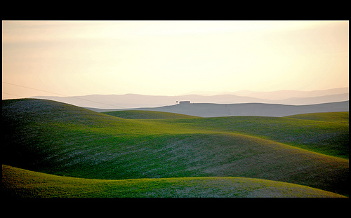
House on the green sea by Luigi Torreggiani on flickr (licensed CC-BY)
Other than the light, the landscape won't suddenly disappear like a shy creature might, so you can take as much time as you need. By walking around the area you want to photograph you can consider the different viewpoints and compositions for the image, and find that which is strongest.
There are a variety of compositional tips, not all of them will be suited to every photograph, but bear them in mind when you are looking for a strong composition.
Rule of thirds
Whenever composition is talked about the rule of thirds is mentioned. It is one of the easiest compositional aids to use, and is used, either on purpose or by accident, in most photos. To use the rule of thirds, you split your image into thirds horizontally and vertically, creating a 3x3 grid. Important items in the photograph should then be placed on these lines, particularly where the lines intersect.
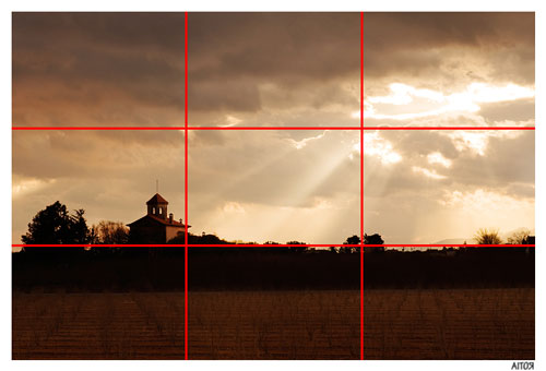
Rule of thirds lines added to sky_aperture by Aitor Escauriaza on flickr (licensed CC-BY)
In the photo above you can see the photographer has placed the building at an intersection of two of the thirds lines, the sun beams are emanating from the upper right intersection of thirds lines, and the tree line / horizon is placed in the bottom third of the image.
You will find that most landscape photos look best with either the bottom third of the image being occupied by the landscape, and the top two thirds by the sky, or otherwise the bottom two thirds occupied by the landscape and the top third by the sky. Which you choose depends mostly on what is more interesting - the landscape or the sky.
You don't need to be deadly accurate when placing important parts of an image on thirds lines, so long as the parts are placed 'around' the thirds it will often improve the composition.
Negative space
You can make your subject stand out by leaving some negative space around it. This draws attention to your main subject, and helps to balance the image. Without negative space the image can feel cramped and squashed.
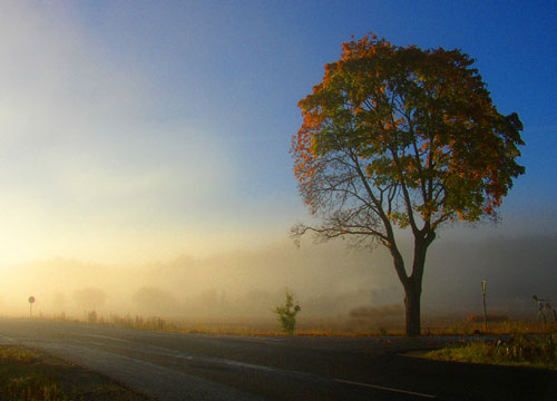
Tree and mist by Per Ola Wiberg ~ Powi on flickr (licensed CC-BY)
Leading lines & perspective
Use lines to draw your viewer's eye into the image. The lines should start at the edge of the image (usually the bottom edge) and lead in towards your subject and / or the horizon. A line that starts of the bottom of the image and then leads off to the right or left edge of the image won't work however, as it leads the eye out of the image.
Usually these lines also converge into the distance. A road, river, fence, etc. leading off towards the horizon can also give the image a good sense of scale.
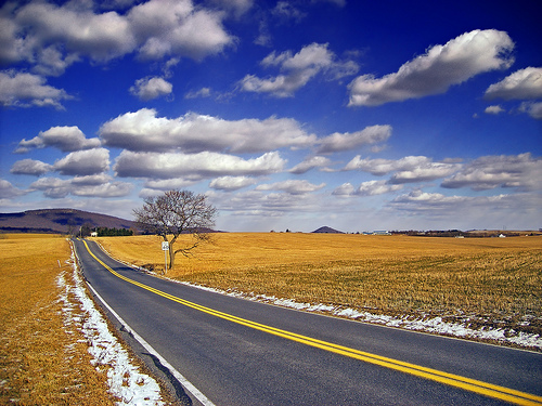
Country Mile by Nicholas A. Tonelli on flickr (licensed CC-BY)
Simplify
Think carefully about what elements you are including in your photo, and whether they add or detract from the image. If something doesn't add to the image, try and remove it, either by moving your position, changing your framing, or physically removing it from the scene (might be difficult if it is a tree).
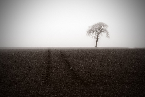
MISTY MORNING by kelp1966 on flickr (licensed CC-BY-ND)
Think about the edges
When framing your photo, make sure to pay attention the edges of the frame. If you have some branches of a tree slightly impinging on the edge of a frame, it is better to change the framing to remove them completely, or include more of them. If only a small part is included it detracts attention away from the main subject of the photograph, and the viewer will wonder whether you meant to include it or not.
Be careful also about including elements at the edge of the frame that lead the viewer's eye out of the image. Anything that creates a converging line leading out of the image should be avoided.
Show scale
Often in landscape photos it can be hard to get an idea of how large the landscape is. By including an object that the viewer will know the rough size of, such as a person, car, or house, you give the image a greater sense of scale.
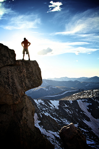
14er Portrait by Zach Dischner on flickr (licensed CC-BY)
Remember, only some, or maybe even none of these compositional tips will improve the composition of a particular photo. This is why you should take your time and evaluate the different possible compositions for a photo before deciding on the best one.


