Eight Ways To Focus A Viewer’s Attention On Your Subject
In photography, it is important that the subject you are photographing is clearly conveyed to the viewer. In a portrait photo, you want the viewer to concentrate on the person, not the background. Going further, you probably want the focus to be on the face, and going further still, probably the eyes, or maybe the lips.
This is true not just for portrait photography, but for most types of photography. With landscape photography, there is normally a main point of focus in the image, for example a tree, the sunset, or maybe a river.
You can help focus your viewer's attention on the important part(s) of the photo by assigning the most important a higher visual weight. There are a number of different factors that are likely to affect how much attention a viewer pays to a particular part of an image.
Size
The larger an item appears, the more it demands attention from the viewer. This relates both to the size of the object in the frame (how much of the photo it fills up) and the perceived size. The perceived size is how large the item appears compared to other objects in the frame when our brain takes distance clues into consideration.
For example, for a photo of a person with a church further away in the background, the person may take up more of the frame than the church, and so would demand more attention. However, the church would still carry some visual weight as we can tell it is larger from depth clues.
Now, if we took the same photo, but with an actual giant person standing next to the church (or maybe use a forced perspective trick), then the person will have an even stronger visual weight. They demand more attention from both their relative size and their perceived size.
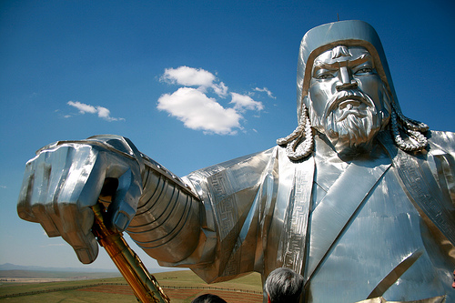
Genghis Khan statue by frans16611 on flickr (licensed CC-BY)
Above, the actual size of the statue is not obvious from this photo, but the eye is drawn to it due its large relative size in the frame. Below, you can see the full size of the statue. Although it is much smaller in the frame, our eye is still drawn to it. Partly due to the steps, but also due to the large perceived size of the statue.
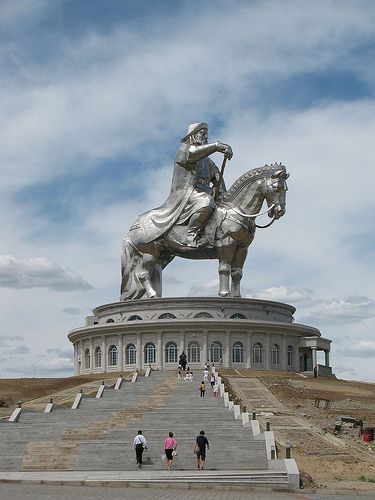
Ginormous statue of Chingis Khan by luigig on flickr (licensed CC-BY)
Tonal Contrast
Tonal contrast can be used to center a viewer's attention on a certain part of a photograph. The main use tends to be a very striking contrast, for example a silhouette against a bright background. Using tonal contrast can work particularly well when your subject is smaller in the frame.
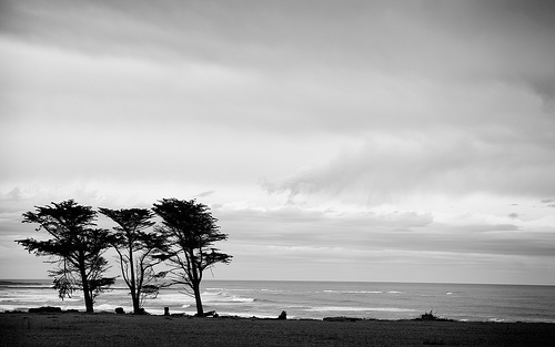
B&w tree - desktop background wallpaper by (matt) on flickr (licensed CC-BY-ND)
In the image above, the trees are relatively small in the frame, yet they demand attention due to the strong tonal contrast.
Color Contrast
Color contrast works in a similar way to tonal contrast. By using a strong color that stands out from the surrounding colors in the photo, you can help focus the viewer's attention.
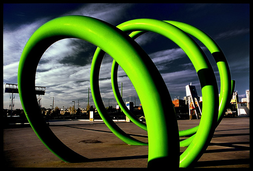
snot spaghetti springtime by mugley on flickr (licensed CC-BY-SA)
The bright green color of the sculpture in the photo above contrasts strongly against colors in the rest of the image, making it clear the sculpture is the subject.
Saturation
The saturation of a color (how intense the color is) can also be used to affect a viewer's attention. Stronger, more saturated colors demand more attention, while dull, muted colors demand less.
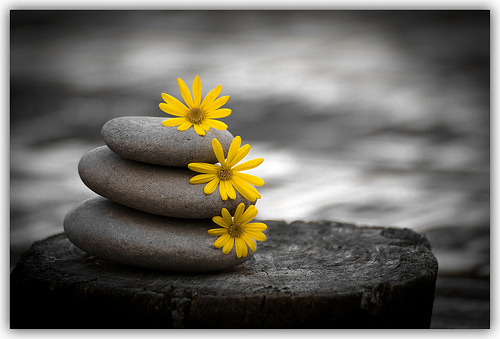
Piedras de primavera, spring stones. by Vvillamon on flickr (licensed CC-BY-SA)
This is exploited especially in selective color photos, where a photo is digitally altered to remove all color except from the main subject. Using saturation to direct the viewer's attention can be used in many other contexts as well, for example a bright yellow flower against a pastel background.
Composition
Where an object is placed within an image can affect how much attention it demands. So considering composition is important. Using the rule of thirds, and placing your subject at an intersection of thirds lines can help focus the viewer's attention on your subject.

Whitby Harbour[1] by Яick Harris on flickr (licensed CC-BY-SA)
In the photo above the lighthouse is placed approximately on the left third line. The line of the jetty edge also helps lead your eye towards the lighthouse. Two compositional tricks used to focus your attention on a certain part of the image.
For more compositional tips, see the section on composition in the free Top 5 Photography Tips to Improve Your Photos PDF ebook.
Focus / Depth of field
Having your subject in focus and the background out of focus is a very good way to draw attention to the subject.

for always by Angelo González on flickr (licensed CC-BY)
To throw the background out of focus, use a large aperture setting to get a small depth of field. Have your subject stand as far away from the background as possible, and you should stand as close to your subject as possible.
Make sure the camera focuses on your subject. The exact way to do this depends on the camera model. On some you can select a focus point, and place the focus point over your subject so the camera will focus on them. On others you will need to point the camera right at the subject, half press the shutter button to focus, recompose the photo as necessary, and then fully depress the shutter. Some cameras / lenses allow you to manually focus as well.
Complexity
The complexity of an object, or how detailed that object is, can draw the viewer's attention.
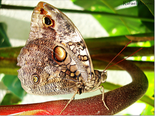
- Bσrbσlєtα. by Rafael Acorsi on flickr (licensed CC-BY-SA)
The photo above has quite a busy background, but your eye is still drawn to the butterfly's wing. This is partly due to the background being slightly out of focus, but also due to the complexity of the wing compared to the rest of the image.
So if you were taking a portrait photo, unless the clothes were an important part of the image, you would ask your subject to wear fairly plain clothes. If the subject wore detailed patterned clothing, the complexity of the clothing would distract the viewer's attention away from the subject's face.
Anomaly (breaking a pattern)
An anomaly, or something unexpected is a great way to draw the viewer's attention. This works particularly well when breaking a pattern. (For more tips on using patterns in photography see the article Repetition a Visual Tool – Turning Chaos Into Art).
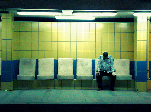
All the troubles lie on his shoulder by Ranoush. on flickr (licensed CC-BY-SA)
In the above shot, the man breaks the pattern of empty seats, drawing your attention to him.
You will probably notice that in the above example photos, each one uses more than one technique for drawing the viewer's attention. The more techniques you combine, the stronger the visual weight your subject will have, and the more it will draw the viewer's attention towards it.
Remember, you don't need to apply all these techniques to only part of the image. Instead, they can be used for distributing visual weight across the image, and providing a guide for what parts of the image deserve the most attention, to which parts deserve the least.
Going back to our example of a portrait photo, we might have the subject filling the frame with the background out of focus. This concentrates focus on the subject. Then, we might have them wear clothes that are quite plain, and not too bright or too dark. So long as the subject's face is well lit, this will concentrate focus on the face.
Then we might have smiling lips, with quite a saturated red color to draw attention to them. And finally, eyes with dark lashes, a dark pupil, and bright whites to create a strong tonal contrast. We may also boost the color saturation of the irises to help draw even more attention to the eyes.
By structuring your images like this, you can provide a guide for viewers as to what parts of the image are the most important. You can guide their eye to exactly where you want it to go. It is unlikely you will use all the techniques in a single image, but certainly bear them in mind.


