7 Tips For Building a Successful Photography Website
A website is almost essential for photographers today. It helps you market yourself 24 / 7. It lets potential clients easily see the sort of work you create, the services or products you provide, and will bring in new clients or sales. Even if you are not interested in sales, it still lets you share your vision with the rest of the world.
However, there are quite a few factors that go into creating a successful photography website. In this article I am not going to go into how to code a website or look at a specific website provider.
Rather, I will go over the important points you need to consider when building a photography website. These are the same whether you are having a website custom built for yourself, or using one of the many photography website providers, such as Zenfolio or Smugmug.
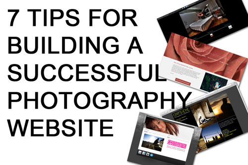
Website screenshots - New Website by Grégory Tonon (licensed CC-BY-SA),
Live to Create Photography by Sarah Zucca (licensed CC-BY-SA),
Redesigned Cat's Eye is Online by Jayel Aheram (licensed CC-BY),
ardenswayoflife.com by Arden (licensed CC-BY-SA)
Design and Interface
A good website needs a good design. You want a site that looks professional, as the website will reflect on you as a photographer. A badly designed website may actually do you more harm than good, making you look unprofessional.
The website interface should be clean, simple, and easy to use. The focus needs to be on the photography. So no animated clipart of a photographer in the header image, no scrolling or flashing text. Preferably no ads. Think minimalistic.
Navigation through the website and images needs to be easy, and obvious. Remember that many visitors will come to your website through search engine results, and will enter the site on an image or gallery page, not the home page. It should be easy for the visitor to view the next or previous image in the gallery, or switch to viewing all images in the gallery.
If your website uses a hierarchical category system, it needs to be easy for the visitor to go back up to the parent category. This sort of navigation is known as 'breadcrumb trail'.
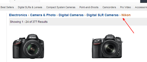
Amazon's website is a good example of implementing a breadcrumb trail. You can easily go back up the 'trail' to a higher level category.
Image display
Images need to be displayed large, and at high quality. How large is 'large' is something you will need to decide for yourself, but certainly 500 pixels wide at the absolute minimum. Ideally images should be 1000 pixels or larger on the longest side.
Displaying photographs so that they fill the screen (known as full bleed) is an increasing trend in photography websites. This will require high resolution images to avoid having to stretch the images to fit on larger screens.
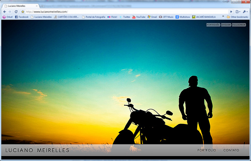
www.lucianomeirelles.com by Luciano Meirelles on flickr (licensed CC-BY-SA)
There is a negative about using larger images - they can be stolen and are more useful to thieves than smaller images, which cannot be printed very large. You can protect your work to some extent by using watermarks on the images.
Some photography website providers also offer right-click protection. This stops people from being able to right-click on an image and save it. There are other ways people can get round this, but it will stop casual image theft.
Ultimately, the risk of your images being stolen is just a price you have to pay. If you are based in the US, then it may be worthwhile to register your images with the US Copyright Office before publishing. This will allow you to claim greater damages if someone does steal your images and you decide to prosecute them.
The compression applied to images is also important. Highly compressed images can look nasty in areas where there is a fine gradient. Save your images with a high JPEG quality before uploading them.
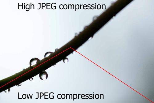
Example image showing difference between high JPEG compression and low JPEG compression - note the banding and blocky texture in the area that should be a smooth gradient near the right of the image where high JPEG compression was applied
A couple of other things to consider are any resizing and converting the website provider does to your images. If you're planning on using a website service, rather than having your own custom website built, check to see how the images of other photographer's using the same service look.
Some website services will automatically convert images to the sRGB colorspace used on the web. Others don't and you will need to convert your images to sRGB yourself. See this article for more information: What are color spaces / color profiles and why are they important?.
Go for the sale
What is the purpose of your website? Why do you want to attract visitors? If it is to attract potential clients, you need to ask them to use your photography services. If it is to sell prints or license stock photography, you need to ask them to purchase. If it is just to look at your photos, ask them to view your other images.
If you do not do this, all you have is an image gallery. Make it clear and obvious what you want the visitor to do, and it is more likely they will take that action.
Making the process easy is also important. If you want people to book you for a photo session, make sure that your contact details are easy to find. If you want to sell prints, ideally use a service that allows the visitor to carry out the whole order process online.
The more steps the visitor has to go through to complete an action, the more likely it is they will give up before completing the action. Any order or contact processes should be as simple and streamlined as possible.
The web is not just for PCs
Responsive design is the current buzzword, but all it means is that your website should be just as usable on a small screened mobile device as on a desktop computer.
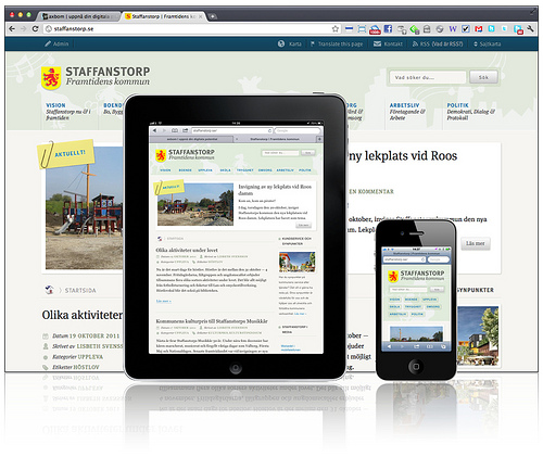
Staffanstorp — Responsive Web Design by Per Axbom on flickr (licensed CC-BY-SA)
If your website does not work properly on tablets and phones, you are missing out on a large proportion of potential visitors.
Website speed matters
We can be quite impatient, and research has shown that a slow loading website will often result in a user giving up. So choosing a website provider or host that offers fast page and image loads is relatively important.

Need for Speed. by Matteo Paciotti on flickr (licensed CC-BY)
However, page loading speed is mainly affected by the page content. If using a photography website provider, make sure they offer themes that have been optimized for page load speed. If having your website custom made, make sure the developer is aware that the site needs to be developed using techniques to minimize page load times.
Search Engine Optimized
Most visitors that come to your website will arrive through finding your site through a search engine. It is important that your site is optimized for search engines, so that your site will appear higher in relevant search results, and more people will click through to visit it.
Search Engine Optimization (SEO) is a large subject. Mostly it relies on the content you produce, but the structure of your website has an effect as well. I will write more on SEO for Photographers in a future article, but an important thing to consider when getting your site built is that the structure is optimized for search engines. Thankfully, most website Themes are.
Portfolio
A portfolio is designed to show off only your very best work. Around 20 - 40 images is a good number. Your portfolio should show the type of images you enjoy taking, the sort of images you want to be booked for to photograph more of.
If you want to get into Wedding photography but your portfolio is full of landscape photographs, then it is unlikely that you will get any Wedding bookings.
If you are lacking the type of images you want to be booked for, then consider spending some money to set up some shoots to capture those images. This should yield some good quality photos you can use for your portfolio. You can later add to or replace them with images from actual bookings you get.
If you photograph multiple genres of photography, then set up separate portfolios for each one. For example, a portrait photographer might have Weddings, Seniors, and Families. Within your portfolio make sure the images have a similar style and gel together as a set, rather than just being a collection of shots.
For many photographers, their website is their most important marketing tool. A poorly designed website can loose you sales or bookings, while a well designed website can get you more. It's a great way to attract new clients and show off the quality of work you can produce.


