How to create postcards from your photos
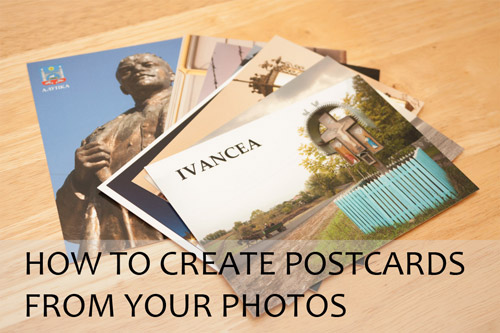
As well as purchasing postcards to post off while on holiday, many people also purchase postcards to take back home as a souvenir. But have you thought about creating postcards from your own photos? The process is enjoyable, and it's fun to see your own photos used on postcards.
Why make your own postcards?
With a postcard made from one of your own photos, you have something more personal and special than a standard postcard. You can choose an unusual photo for the design, something that you probably can't buy as a postcard.
Depending on where you visited, there may not even be any commercially produced postcards available of the location. Printing your own postcards allows you to show off locations you've visited that are off the beaten track.
You can send your own postcards to friends after you get back from holiday. The fact that the postcard features one of your photos on the front makes it more personal. The card will probably arrive with the recipient around the same time it would have if you'd sent it from abroad as well, international post is often very slow.
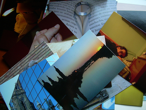
Postales desde el filo by sergis blog on flickr (licensed CC-BY)
Postcrossing is a popular project where people from around the world send postcards to each other. A custom postcard can be used for this as well, to show the recipient where you've been.
You don't have to use photos of locations you've visited either. Postcards of your family or pets can be great for sending to other family members.
And lastly, creating your own postcard can be quite fun. I like seeing the final result as a real postcard. But even if you don't get the postcards printed, the creation process is enjoyable, and you can always send them as e-cards.
Putting together the postcard design
First of all, you'll need to go through your photos and find some you think will work well for a postcard design. A postcard can have just a single photo, or it can be a multi-image design. With a multi image design, you'll normally want some sort of theme that links the images together, probably being that they were all taken in the same town or area.
Knowing the name of the town or area where the photos were taken is important as well. Including the name on the postcard somewhere is standard practice.
The design of the postcard is really up to you, there are no hard and fast rules. However, if you intend on getting the postcard printed, you need to make sure that your document is set up for the correct dimensions for printing correctly.
So you will need to decide where to have your postcards printed ahead of time. Some postcard printing services offer a template you can download to aid in laying out the postcard.
This will usually include some bleed area to the edges - this is area that will be printed, but goes beyond where the postcard will be trimmed. It allows for small inconsistencies when printing or trimming. If there was no bleed then a small offset when trimming would mean that the printing didn't go all the way to the edge of the postcard.
When designing the card, you might choose to have a border round the edge, or you might go for the photo covering the front entirely. If you do choose to have the photo (or photos) going right to the edge of the postcard, then bear in mind they will need to be slightly larger than the card size, and the edges used as bleed will be trimmed away.
Let's look at an example of designing a card. For this design I'll work with the postcard template from Moo.com. I'm using Photoshop CS5, but the process is the same in Photoshop Elements (with a couple of exceptions, which I've noted in the text). The general process will also be the same in GIMP and Paintshop Pro, except that the keyboard shortcuts and menu command names will be different.
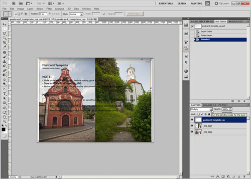
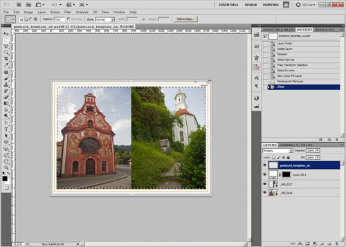
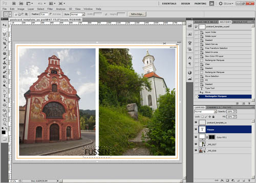
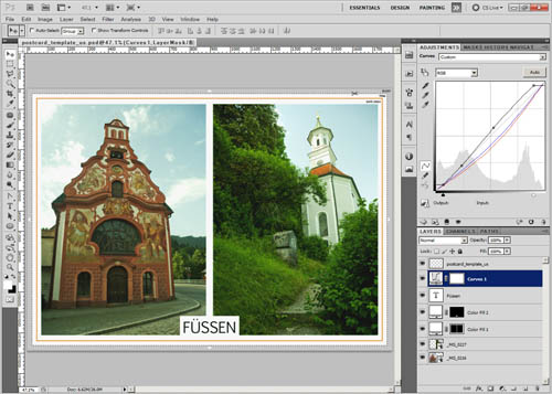
I downloaded the PSD postcard template and then opened it in Photoshop. I decided to use two photos for this postcard, so I have added these as layers to the postcard document.
Then I moved the postcard template layer above the other layers and changed it's blend mode to multiply. This means that only the darker colors and tones will show through over the layers below, so we can see the bleed and crop guidelines over the layers below.
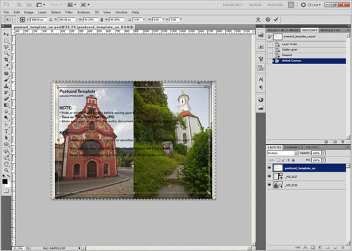
For this photo I want to add a border round the edge. The easiest way to get a proportionally sized border is to press Ctrl + A to select all. Then go to Selection > Transform Selection on the menu.
With the mouse, grab one of the handles at a corner of the selection. Holding down the shift and alt keys, drag the handle towards the center of your postcard, until the area outside the selection is the size you want for your borders (and bleed). Note that in Photoshop Elements you don't need to hold down the shift key if 'Constrain proportions' is ticked in the tool options.
If you hold down only the alt key when resizing (and with Photoshop Elements 'Constrain proportions' is not ticked in the tool options), then you can center the resize without resizing proportionally. This is what I'm doing for my postcard.
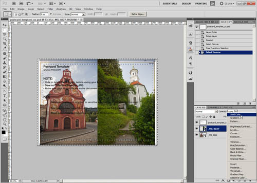
When the selection is the correct size, press Enter on the keyboard to accept the transformation. Now we have the center area of the postcard selected, but we actually just want the border area selected. So press Ctrl + I to invert the selection.
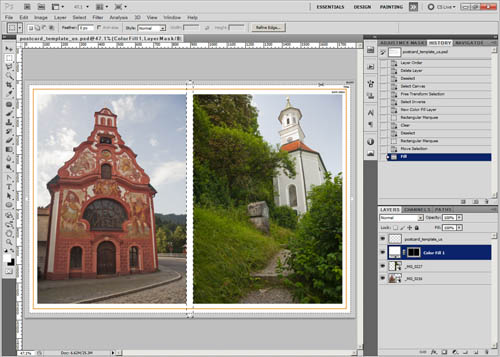
Then create a new color fill (solid color) layer, filled with white. This will automatically use the selection as a layer mask, so it will only show the white color in the area we had selected (around the edge of the image).
The text on the Moo.com template is a bit distracting, so I'm going to delete that. I use the rectangular marquee tool to select it, then press the Delete key on the keyboard (while selected on the template layer) to delete the text.
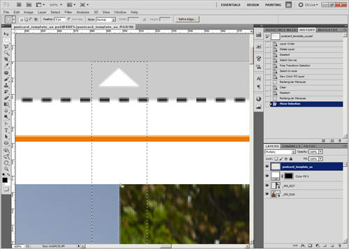
Press Ctrl + D to deselect. The next thing I want is a white border separating the two images at the center. To do this, the rectangular marquee tool can be used again, to draw a long rectangle down the center of the postcard. Getting it exactly centered is very tricky, but you can move the selection to get it centered after drawing it. Zooming in can help here.
Select the white color fill layer's layer mask in the layer palette. Then fill the selection with white. My foreground color is white, so I can do this by pressing Alt + backspace. Press Ctrl + D to deselect when done.
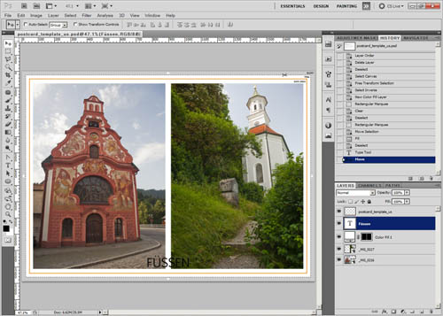
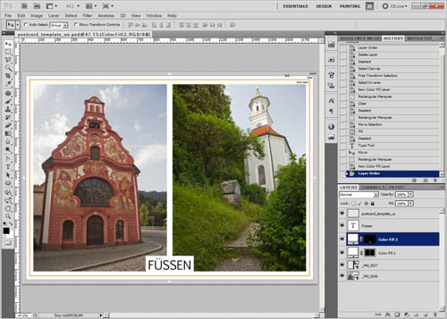
The next step is to add the text. For this postcard, I think I'll add it at the center near the bottom. Use the type tool to add your text, then use the move tool to position the text so that it is positioned where you want it. If you're using Photoshop Elements and having trouble selecting the text to move it, make sure that 'Auto Select Layer' is unchecked in the move tool options.
You might want to spend some time playing around with different fonts, sizes, and styles when adding the text.
In this case I want to use black text with a white background behind it. To create the white background the rectangular marquee tool can be used to create a selection around the text.
I could add the selection to the white color fill layer used for the borders. But I think it will be better to use a new layer. That way the white area behind the text can be adjusted easily (e.g. made bigger or smaller) without affecting anything else. So I create another new color fill layer, filled with white.
The selection automatically creates a layer mask for the layer, so it only applies to the area we had selected behind the text. The layer needs positioning below the text layer (otherwise it covers up the text).
If the white background behind the text is not aligned correctly, you can easily move it using the move tool, or change its size using a free transform.
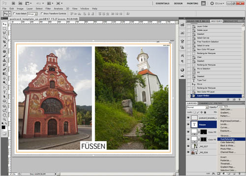
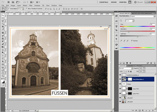
Something you may want to try with some of your postcards is creating a vintage style photograph. To do this, create your postcard normally, but try and use an appropriate font that will fit with a vintage postcard when adding the text. Now create a Hue / Saturation adjustment layer.
In the hue / saturation settings, check the dialog checkbox. Adjust the hue to taste. I like an orange-brown sepia tone. Adjust the saturation to taste, I like the default value of 25. And adjust the lightness to taste. Boosting the lightness gives a slightly faded look to the images.
You can also adjust the colors and contrast for a 60s or 70s look to your postcard. These typically have quite strong contrast and saturation, with skies appearing more cyan than blue.
There are lots of different ways you can apply a retro look to your postcard. For this example, I've used a curves adjustment.
Using curves I pulled down the red curve - this adds cyan. I pulled down the blue curve, which adds yellow. For the RGB curve, I pulled in the white and black points to increase the contrast. Then I pulled the white point down, so that the white point is about 97% white rather than pure white. And I did the same thing to the black point (except pulled it up). I also applied a couple of other points on the curve to adjust the contrast slightly.
When your design is finished, you can hide (or delete) the postcard template layer, and save the image for printing.
The back
For the back of the postcard, most postcard printing services will offer a default back design that you can use. Or you can create your own. Depending on the printing service, you may need to use the same back design for all the cards. If the service allows for different back designs, then you can add in the names and locations of the photos in small print on the back, as is done on professional postcards.
Another idea for the back design is to scan in the back of an old postcard you have.
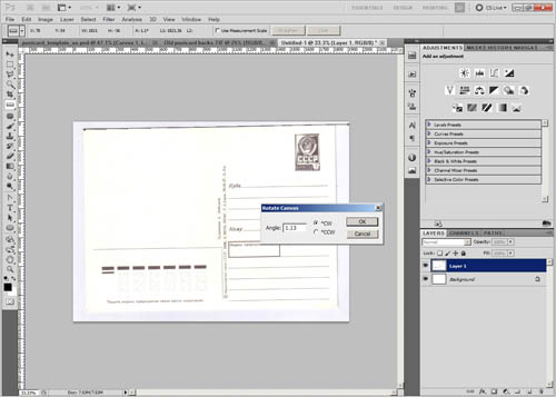
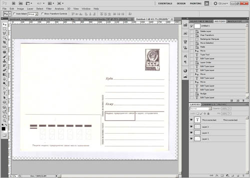
If you go the scanning route, then after scanning the image, you will need to straighten it. In Photoshop you can do this by using the ruler tool to draw a straight line along one of the postcard's edges. Then go to Image > Image Rotation > Arbitrary. The rotate value will automatically be filled out with the rotation value needed to make the line you drew straight. So click OK to rotate the image.
In Photoshop Elements you can use the straighten tool, which will automatically straighten the image when you draw along the postcard's edge.
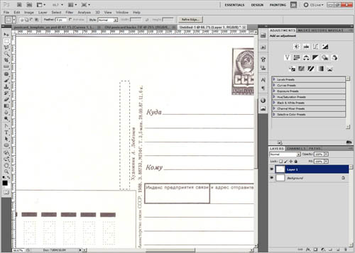
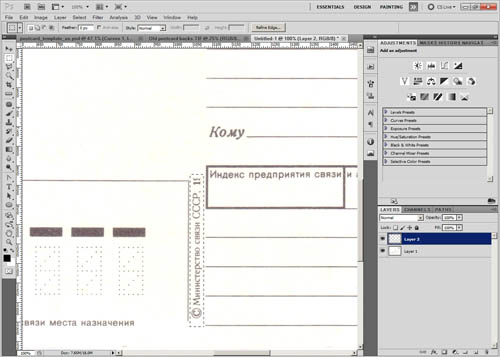
The next thing to do is to clean up the bits of text on the back that are specific to the postcard. There are quite a lot of different ways that this can be done. To start with, I'll draw a marquee selection area alongside part of the text.
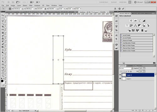
Press Ctrl + J to copy the selected area. Then press Ctrl + T for free transform. Pull the right edge of the selection to the right so it covers the text.
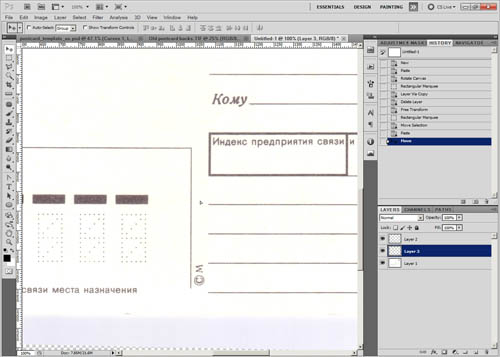
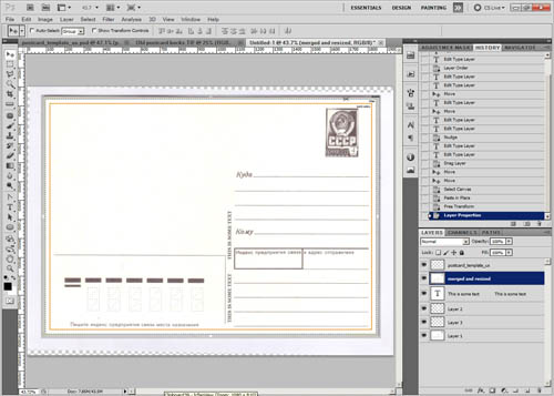
To get rid of the rest of the text, I'll first select it with the rectangular marquee tool.
Then move the selection up to a blank area. Copy from the blank area (you can use Ctrl + Shift + C in Photoshop to do a 'copy merged', which copies the visible area rather than copying the contents of a specific layer). Then move the copied area back down to cover up the text.
Bear in mind when doing this that the rear design of a postcard is copyrighted to a certain extent. Unless you have a very old postcard that is out of copyright, technically you will be breaking the law by using an old postcard back without obtaining permission. For this example I'm using an old USSR postcard, and since the Soviet Union no longer exists I don't think they'd be too bothered about this design being copied.
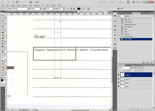
If you want to add your own text over where the previous text was, use the Type tool to draw a text box. In this case the text needs rotating. Put the mouse cursor just outside the text box, and it should become a rotate symbol. Click, then rotate the box by -90°. After clicking hold down the shift key while you drag to make the rotation snap.
After rotating the textbox, you can type your text. Use the move tool to adjust the positioning. Use a font that fits in with the rest of the design. It is also a good idea to change the text color to the same ink color as used on the rest of the card.
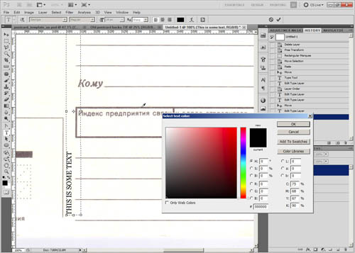
To do this, click on the color in the text options, then use the eye dropper to click on some of the ink in the image. This will change the color to the same color that you clicked on. In PSE 11 you need to click the color in the text options, then click the small color wheel icon in the bottom left corner of the colors box that pops up. From there you get to the color picker dialog where you can sample a color from the image.
If you really wanted, you could also apply some of the card's texture to your new text, to make it really fit in. But this is a bit much to go into for this tutorial.
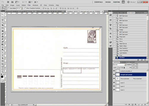
When you're done editing the scan, add the postcard template as a layer, and make sure the back is the correct size (including bleed). If not, then resize as necessary.
Crop the image per the template (if necessary). A quick way to do this is to Ctrl-click the template layer in the layers palette. This makes a selection based on the layer contents (the template). Then go to Image > Crop to crop the image to the selection.
Hide the template, and then save the image ready for printing.
For getting the postcards printed, there are a lot of online services you can use. You can also try your local printers or copyshop.
A local printers will likely be (quite a lot) cheaper if you want to get a large number of cards printed all with the same design. But for a small number of cards with different designs, going through one of the web based companies will likely be quite a bit cheaper. Personally I like Moo.com.
Looking through your photos for postcard worthy images (or purposefully choosing non-postcard worthy images) can be enjoyable, as well as making the actual designs themselves. It is a nice way to show off your photos or add a personal touch to holiday postcards.
