Understanding Depth in Photography
Photographs are 2D captures of our 3D world. Yet we can still understand the form of items in photographs thanks to depth cues. In some cases, such as abstract and trick photography, it may actually be preferred to avoid anything in the photo that indicates depth.
Understanding the different depth cues that can be used in a photo can help you make stronger photos. When you know these cues you can ensure you include them to make an image more '3D', or ensure you don't include them for a flatter '2D' look.
Highlights & shadows
You may think that the main use of depth is in landscape photography, capturing vast vistas that run off to the horizon. But actually depth is important in almost all photos. Without depth your subjects would have no form, and just be 2D shapes.

WL X1600 by Richard Melanson on Flickr (licensed CC-BY-ND)
Lighting is what brings out the form of a subject. The way that highlights and shadows fall across the subject show its form. Without highlights and shadows the subject would look flat and 2D.
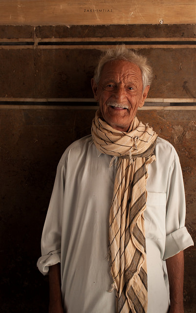
Baba Shami by Z Imtiaz on Flickr (licensed CC-BY-SA)
Using directional lighting, and ensuring it comes from a direction that is not from the exact same position as the camera is the best way to show the depth of a subject. If the lighting is coming from the camera (such as pop-up flash), and this is the only or dominant light source, then the shadows cast will look relatively small from the camera position.
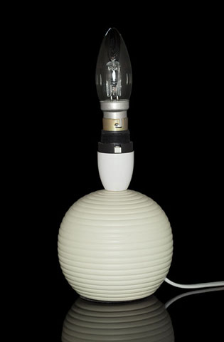
Using frontal lighting from the camera position gives an image that looks very flat and 2D
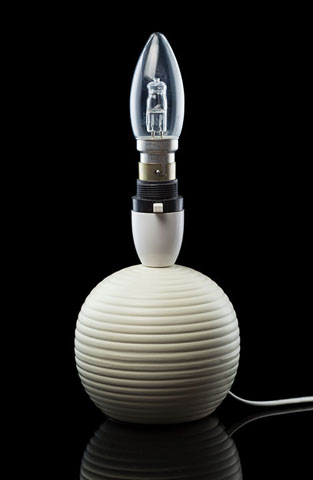
Using directional lighting from angles away from the camera position gives an image that looks much more 3D
Lighting from more of an angle brings out the form much better. The light rakes across the subject's surface, bringing out the 3D form and texture.
Converging lines
A depth cue commonly used in landscape and architectural photography is converging lines. This is two or more lines that get closer together (in the photo) as they recede into the distance.
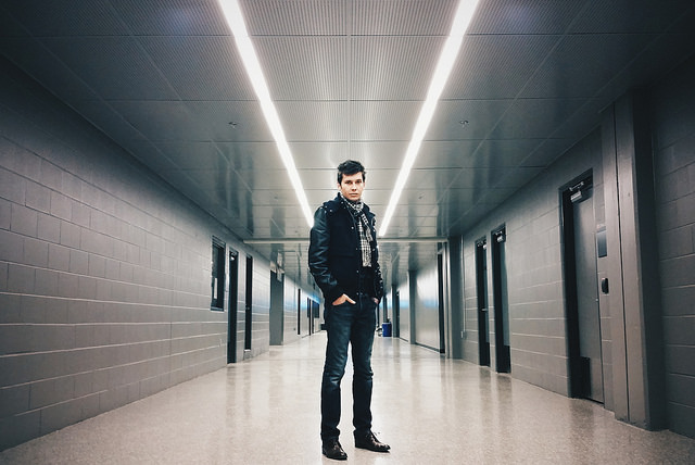
converging lines by Asparukh Akanayev on Flickr (licensed CC-BY)
Examples include fences, rivers, paths, roads, power lines, buildings, rows of crops. Basically anything that includes two or more lines.
The wider the angle of view you have, the more quickly and dramatically lines start to converge.
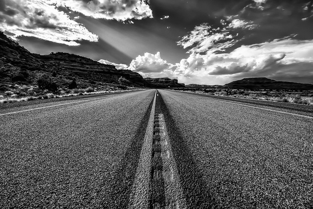
The Road Ahead by Marcela on Flickr (licensed CC-BY)
Size
In the same way as converging lines work, items look smaller as they go into the distance, giving us depth cues. This mainly works when you have a large item that spans quite some distance - you can see the end nearest you looks larger than the end further away.
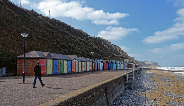
Cromer beach huts by DncnH on Flickr (licensed CC-BY)
It also works pretty well when using objects that are of a known size. For example, trees look smaller in the distance than they do close up. But when you see a small (in terms of size in the image) tree off in the distance in a photo, you don't think what a small tree
, you think that tree must be far away
.
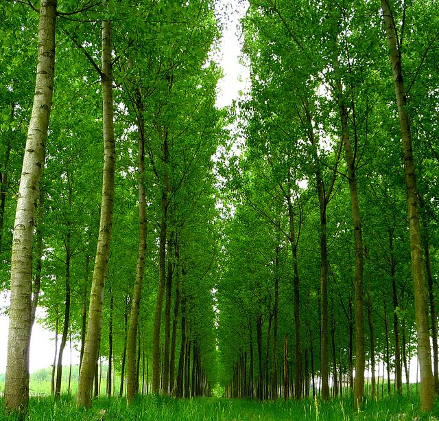
Punto di fuga. by Luciano on Flickr (licensed CC-BY)
If there are no other depth cues in the image and the image is arranged so both near and far items appear to be in the same plane, then size doesn't work so well as depth cue on it's own. This type of image can actually be purposefully used to make things seem smaller (or larger) than they really are.
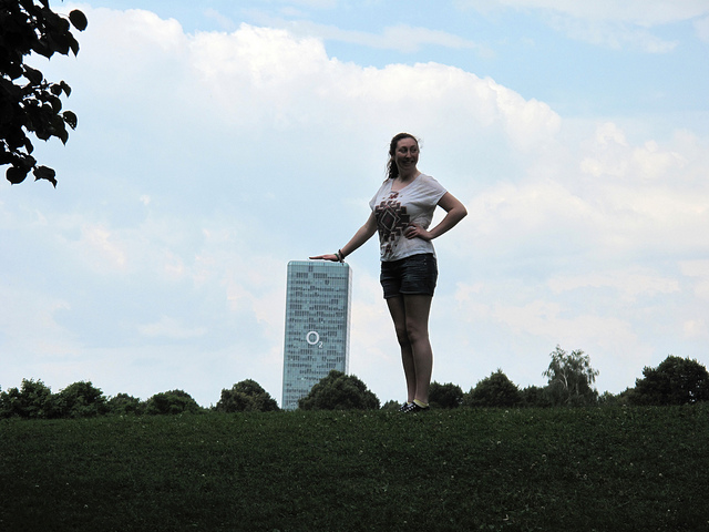
Perspective by Kate Elizabeth on Flickr (licensed CC-BY-ND)
Contrast
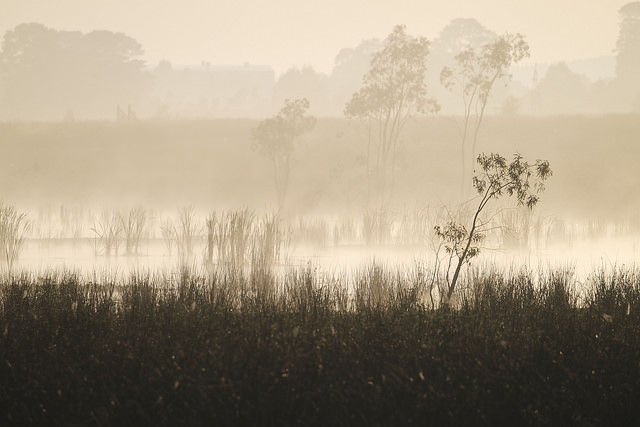
For images that contain elements with a large distance between them (typically landscapes), then contrast can work as a depth cue. Items further in the distance will appear more hazy and low contrast than items nearer the camera.
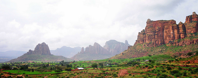
Tigray, Ethiopia by Rod Waddington on Flickr (licensed CC-BY-SA)
It's important to bear this in mind when post-processing images. It can be tempting to increase the contrast in hazy background areas of an image to make the image 'pop'. But doing this will also reduce the depth visible in the image.
Photographing in misty or foggy conditions also has the same effect of indicating depth, only much stronger as items far away will disappear into the cloud completely.
Depth of field
The last depth cue we'll discuss is depth of field, that is, how much of the image from near to far is in sharp focus. A deep depth of field, where all the image appears in focus, doesn't help demonstrate depth. This is usually the case for landscape photography, where other depth cues are relied on instead.
A shallow depth of field demonstrates depth because items further away from the plain of sharp focus (both in front and behind it) appear more blurry the further away they are.

Hà Nấm 's Birthday 19th by Mac Vincente | ® © on Flickr (licensed CC-BY)
For outdoor environmental portraits, a shallow depth of field helps concentrate attention on the subject because they are much sharper than the background. But it also gives the image more depth and makes it look more '3D' thanks to the change of sharpness in the foreground and background with distance from the subject.
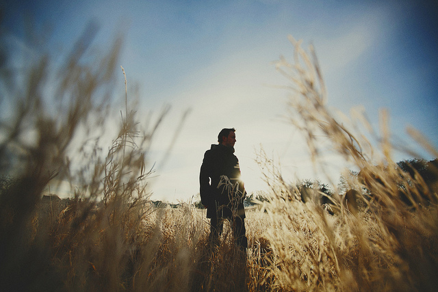
47/52 Frosty Morning (lazy 52) {explored} by philhearing on Flickr (licensed CC-BY)
The vast majority of the time we capture depth in our images without specifically meaning to. There are often two or more of the above depth cues present in our images naturally.
However, it is still worth understanding what gives a photograph depth. This enables you to purposefully emphasize or de-emphasize depth as you wish, and gives you more control over your photography. So you can make sure your photos tell the story that you want.
